Archive | InBrief
Data to dashboard: Making sense of big data
Data to dashboard: Making sense of big data
Our Advanced Analytics team’s obsession with the NFL led us on an ambitious journey to collect NFL Twitter data with the hopes to gather some useful insights. As the weeks went by, millions of tweets were collected. With this data being amassed, we established the arduous objective to understand the type of events that surround large influxes of tweets. Hadoop was great to store this data and perform sentiment analysis on it, but we needed a more optimal solution for reporting. With a few paper mockups later, we had our designs in hand and idea of how we can make this available for consumption.
To enable the next stages needed to process this information, we needed a SQL server for staging, a SQL Server Analysis Services (SSAS) server to deliver the semantic layer, and the ability to host applications. Azure was a perfect fit for this due to its fast provisioning and pre-installed images. We were able to spin up these types of servers quickly and all managed by Azure, so the typical woes associated with infrastructure were no longer issues. Now that we enabled the ability to store this data, we needed to build out the process.
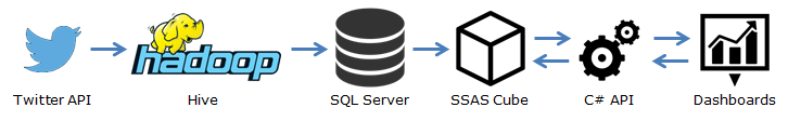
Here is a general outline of the end-to-end architecture for this solution:
Staging
As we had collected the large dataset of unstructured tweets, we built a process to normalize this data into a SQL server database. With the data being stored in a star schema, it would allow us to perform extra processes that can enrich different aspects of the data. With that being said, here are 2 specific examples:
- The database has a Hashtag dimension that was defined with a foreign key on the Tweets fact table. On the Hashtag dimension, there are the fields with the hashtag and team ID. This is how a tweet gets associated with a team. Initially, the original hashtags that were used to collect these tweets were associated with the team IDs and any hashtags that could easily be inferred to a specific team were associated as well (i.e. having the team name in the hashtag). It was designed this way so that a process can be built on top of this table to define the associations between a hashtag and a given team. For example, this process could look for players’ names or coaches’ names and associate a hashtag with that team accordingly. The star schema design allows the flexibility of updating a dimension without having to update the fact table. On load of the SSAS cube, the association between a tweet and a given team is inferred based on the relationship the hashtag has to a given team.
- The database also has an Event dimension. An event is defined as a volume of tweets in a specific time period for a team that was well above the standard deviation for that team. The event dimension right now has a basic process built on top of it to perform this type of analysis with columns such as Name, Team ID, Start Date, and End Date. The process inserts new events into this table with the name being the tweet content that had the largest amount of retweets for that event. Due to its flexibility, this process can be built out to perform more extensive analysis to define an “event”. On load of the SSAS cube, the join is inferred based on the tweet date as it falls between the start and end date/time and the team ID the tweet belongs too.
Modeling
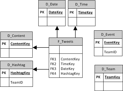
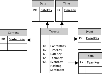
Per the examples above, here is the schema for the SQL database (top) and SSAS Cube (bottom):
Now that we have a normalized set of data in a database, we needed to supercharge it so that it could be quickly retrieved for presenting. The Microsoft SSAS tabular cube was used because of its in-memory columnstore VertiPaq engine. Since this data will be sliced by columns that are easily indexed (e.g. team, hashtag), it will allow a quick retrieval using the SSAS tabular cube. To give an idea of how well the data was compressed, it went from storing 66 million tweets in a 10GB SQL server database to a compressed 1.5GB SSAS tabular cube. At this point, the data was able to be retrieved in seconds for even relatively complex queries. Since the data was now easily retrievable, it was time to focus on the dashboard.
Visualizing
To have granular controls and ample flexibility when mocking up these visualizations, we decided to focus on open source tools. This led us to D3, which is an open source charting library. D3 allows us the flexibility of a robust solution, but is lightweight and mobile-capable out of the box. It also gives us full control of the user interaction, which is important for displaying this type of data. It’s important to note that SSAS tabular cubes are supported by many different products such as Tableau and SQL Server Reporting Services, if a custom solution isn’t an option.
To consume the cube, we built a simple C# API that is able to retrieve parameters and return structured JSON. Here is a sample below:
{
"teamKey": "16",
"teamName": "Dallas Cowboys",
"helmetURL": "https://dl.dropboxusercontent.com/u/36446457/helmets/cowboys-helmet.png",
"tweetCount": 3062610,
"sentiment": "Positive" },
{ "teamKey": "38",
"teamName": "Philadelphia Eagles",
"helmetURL": "https://dl.dropboxusercontent.com/u/36446457/helmets/eagles-helmet.png",
"tweetCount": 2667382,
"sentiment": "Positive"
},
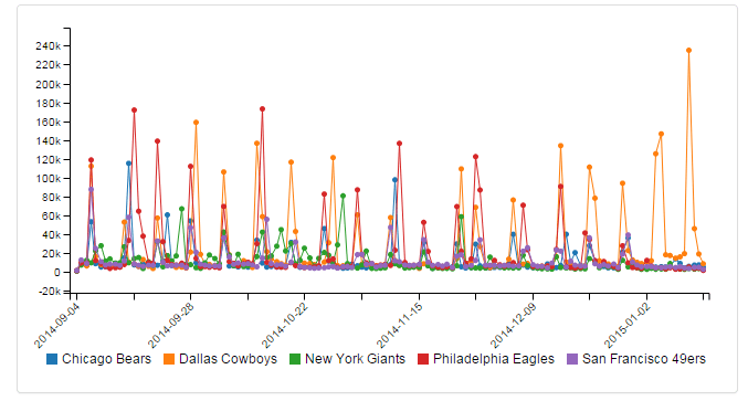
This can then be consumed by the front-end application, so that it feeds the various tables and charts on a given page. D3 is able to consume this JSON directly or leverage JS objects. The D3 syntax allows for easy customization of charts and the outputs can be bound to any object on the page. Here is an example of how the chart that depicted the top 5 teams was created.
D3 JavaScript:
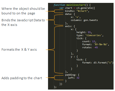
Chart Output:
Using other open source frameworks such as Bootstrap, we were able to make the dashboard responsive and lightweight for most clients. With considerations for performance and flexibility, it is imperative that you focus on user experience so that your end result is easily consumable. There were many other paths we could have took with the consumption of this data (i.e. MongoDB document storage, Tableau, etc), but it’s important to note that when building out these big data solutions, choosing the right tool for the job is crucial in succeeding.

